Microsoft is testing a redesigned version of its virtual assistant for iOS and Android
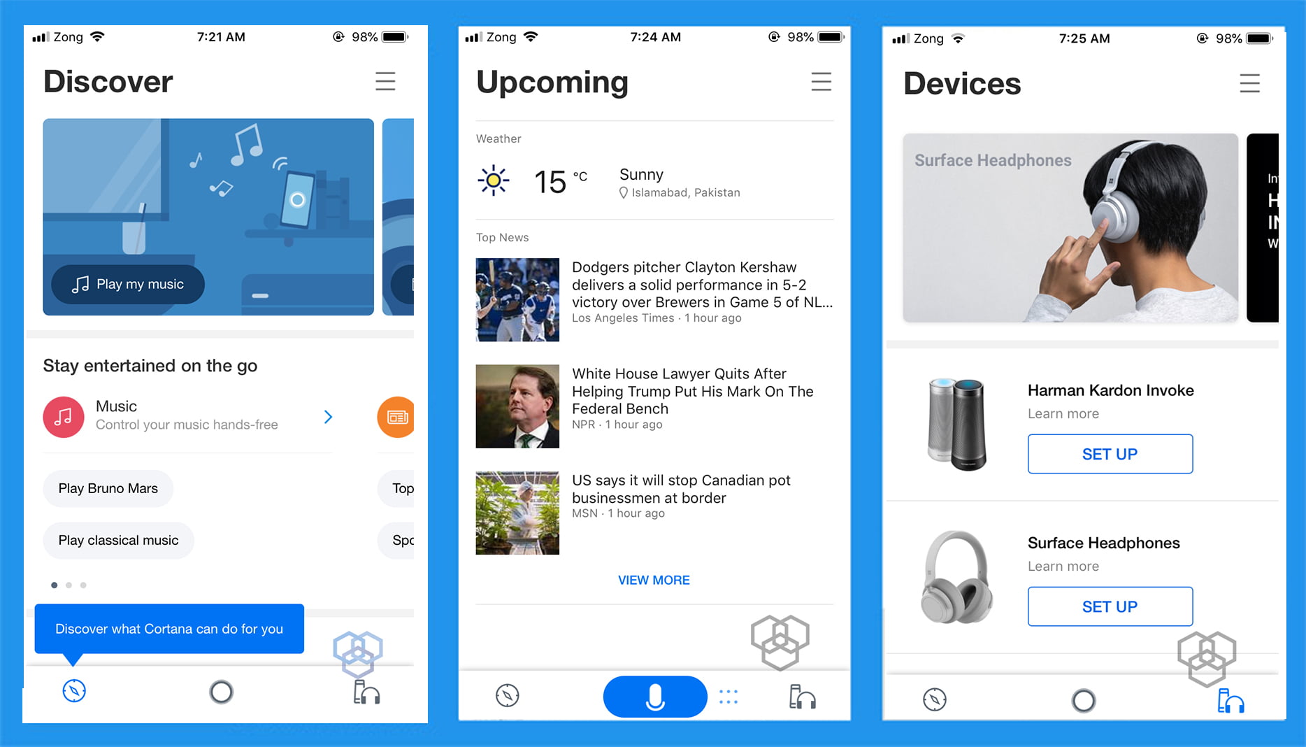
Microsoft is testing a redesigned Cortana in the latest beta version of the app for both Android and iOS. The newest beta delivers an updated UI and improvements in the feature.
Cortana v3.0 now integrates better with the rest of the Microsoft ecosystem. The app is now organized in three tabs: Discover, Upcoming, and Devices from left to right. Discover tab aims at introducing voice commands and things Cortana can do for you. You can ask “tell me a joke” and Cortana will respond with a joke. The Upcoming tab is where the Cortana rests with the ability to provide you results when asked. Use the icon to say “What’s the weather” and weather forecast will appear on your screen. The Devices tab lets you seamlessly connect your phone with Cortana enabled devices, such as Surface Headphones and Harman Kardon Invoke smart speaker.

The new user interface looks clean and feels a fresh start. With a dedicated tab for Cortana enabled devices, it seems like Cortana is still an important product for Microsoft. Semantic Machines, an AI startup was acquired by Microsoft earlier this year to make Cortana better and sound more like a human. There was also a preview update that integrates Cortana with Alexa.
The new Cortana also lets you manage your calendar, create meetings, set essential reminders and as to join Teams app meetings. Along with these features, you can send short emails by voice now.
Cortana might not be your primary voice assistant, but it is clear that Microsoft is working on the betterment of the service, even if they have to integrate with its competitors. Recently, Google also rolled out Google assistant redesign for Android and iOS.
Let us know what do you think of Cortana redesign, share your views in the comments!


Share Your Thoughts