Chrome is Changing its Logo for the First Time in a Decade
February 7, 2022
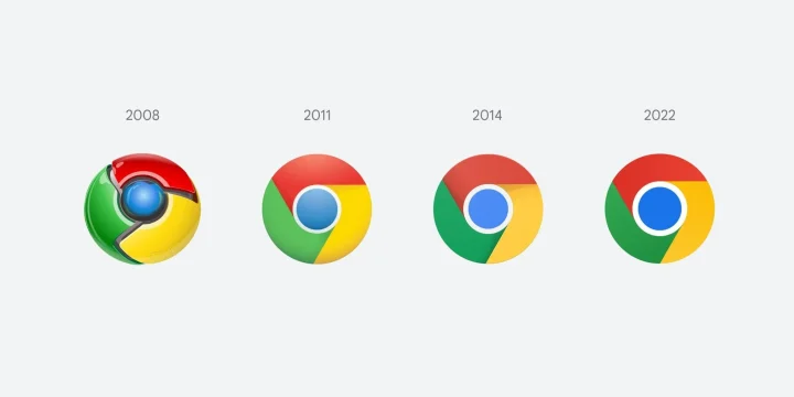
Google Chrome has the legacy of the consistent and same iconic logo since 2014. Throughout the period, the Chrome logo was changed but the central idea remained the same, i.e., a colorful circle divided into four parts. Red, blue, green, and yellow are the iconic colors that, despite many changes, remained the same. It is one of the most famous web browsers which was launched in 2008. Back then, the logo was three-dimensional, with a circle divided into four colorful parts: blue, red, green, and yellow.
The color composition and unique shadows at the boundaries of the Chrome logo have changed now. We confirmed it from the Twitter threads of a Google Chrome designer, Elvin Hu. He has even confessed that distinguishing between different Chrome logo versions is a daunting task for the naked eye. So, for the convenience of the viewers, he has placed all the previous Chrome logo versions along with a few explanations. The changes are so subtle, professional, and enthralling that making an accurate guess is difficult for a common person. We will make it easy to understand the changes made in Chrome in this news article.


Share Your Thoughts