

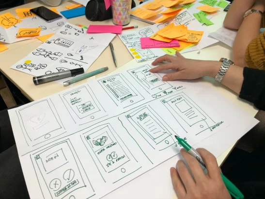
Great mobile app design is invisible. When an app just works — when you find what you need without thinking, and every tap does what you expect — you rarely stop to admire it. But the moment something feels off, you notice instantly, and you’re one frustrating screen away from uninstalling. In 2026, with users more impatient and more accessibility-aware than ever, the bar for mobile user experience (UX) is high. The good news is that the principles behind a great experience are well established. Follow these guidelines and you’ll design apps people actually keep.
Mobile UX design is the practice of building apps people can navigate fluidly on small screens, usually with a single thumb, often while distracted. That real-world context — the bus, the checkout line, the couch — shapes every decision below.
1. Make navigation intuitive and thumb-friendly
Navigation is the backbone of your app. If users can’t figure out where they are or how to get where they want to go, nothing else you design will save the experience. The goal is for people to move through your app without conscious effort.
Research shows the large majority of mobile interactions are thumb-driven, and on today’s big-screen phones the bottom third of the display is the easiest area to reach. Design accordingly:
- Use a bottom tab bar for your core sections — it keeps primary navigation always visible and within thumb reach.
- Limit primary navigation to about five items. More than that and the app feels cluttered and choices get harder.
- Follow familiar patterns. Users arrive with expectations shaped by every other app they use. Reinventing standard gestures and icons forces them to relearn, which creates friction.
2. Design for accessibility from the start
Accessibility is no longer a “nice to have” or a compliance box to tick at the end — in 2026 it’s table stakes. Designing for people with visual, motor, hearing, and cognitive differences makes your app more usable for everyone, including able-bodied users in bright sunlight or on a bumpy train.
- Touch targets: follow Apple’s minimum of 44×44 points and Google Material’s 48×48 dp; WCAG recommends at least 44×44 CSS pixels. Small, cramped buttons cause mis-taps and frustration.
- Color contrast: aim for at least a 4.5:1 ratio for normal text and 3:1 for large text (WCAG 2.2 AA). Never rely on color alone to convey meaning.
- Dynamic type: respect the user’s system font-size settings instead of locking text to one size.
- Screen readers: label every interactive element so VoiceOver and TalkBack can describe it, and provide alternatives for any swipe or pinch gesture.
3. Personalize the experience thoughtfully
People expect apps to feel tailored to them. Personalization — showing relevant content, remembering preferences, and adapting to how someone actually uses the app — makes an experience feel effortless and keeps users coming back. One of the biggest shifts in 2026 is the move from reactive interfaces to predictive ones, where the app anticipates needs based on behavior and context.
The key word is thoughtfully. AI-driven personalization works best when it’s inline, contextual, and opt-in — a helpful suggestion at the right moment, not an intrusive takeover. Be transparent about what data you use, give people control over it, and never let personalization tip into feeling creepy or manipulative. Trust, once lost, rarely comes back.
4. Provide clear, immediate feedback
Every action a user takes should produce a visible reaction. Feedback tells people the app heard them and is doing something — without it, users tap again, get confused, or assume the app is broken.
- Button and touch states that respond instantly to a tap.
- Loading indicators, progress bars, and skeleton screens for anything that takes more than a moment.
- Clear, human error messages that explain what went wrong and how to fix it — never a raw error code.
- Confirmation for important actions like deleting or paying, so users feel in control.
5. Minimize the effort you ask of users
Typing on a phone is tedious, so every field you require is a small tax on the user — and taxes cause abandonment, especially at sign-up and checkout. Reduce the effort at every turn.
- Ask only for what you genuinely need, and defer optional details until later.
- Use autofill, smart defaults, and the correct keyboard type for each field (numeric pad for numbers, email keyboard for emails).
- Offer biometric login (Face ID, fingerprint) and social or passkey sign-in instead of forcing long passwords.
- Let people accomplish core tasks as a guest before demanding an account.
6. Make speed and performance a design priority
No amount of beautiful design survives a slow app. Speed is user experience. A 2025 Google study found that around 70% of mobile users expect pages to load in under two seconds, and apps that take more than three seconds to become interactive see roughly 40% higher bounce rates.
Design with performance in mind: optimize and lazy-load images, keep animations lightweight, show content progressively rather than making users stare at a blank screen, and make sure the app degrades gracefully on slow or spotty connections. A fast, slightly plainer app almost always beats a gorgeous, sluggish one.
Test with real users, not assumptions
The guidelines above will get you most of the way, but no designer can predict every way a real person will use an app. The teams that ship the best experiences treat their own opinions as hypotheses to be tested, not facts. Usability testing — watching actual users attempt real tasks — reveals friction you’re blind to because you already know how your app works.
- Test early and often. You don’t need a lab. Even five users tapping through a clickable prototype will surface the majority of major usability problems before you write production code.
- Watch, don’t lead. Give people a task and stay quiet. Where they hesitate, tap the wrong thing, or give up tells you more than any survey.
- Test on real devices and conditions. An app that feels great on the latest phone over office Wi-Fi may crumble on an older device with a weak signal — which is how many of your users actually experience it.
- Use analytics to find the “where.” Drop-off points, rage taps, and screens where people abandon a flow point you to what needs fixing; then talk to users to learn why.
Great UX is never “done.” Ship, measure, learn, and refine — the apps people love are the ones whose designers keep listening.
Frequently asked questions
What is the difference between UX and UI in mobile design?
UI (user interface) is how an app looks — the colors, buttons, typography, and visual layout. UX (user experience) is how it works and feels — how easy it is to navigate, complete tasks, and reach a goal. Good UI serves good UX; a beautiful screen that’s confusing to use is a UX failure.
What is the recommended minimum touch target size?
Apple’s Human Interface Guidelines recommend at least 44×44 points, Google’s Material Design specifies 48×48 dp, and WCAG accessibility guidance recommends a minimum of 44×44 CSS pixels. Designing to these sizes reduces mis-taps and makes your app usable for more people.
How does AI change mobile UX design in 2026?
AI is shifting apps from reactive to predictive — anticipating what a user needs based on behavior and context. Done well, it’s contextual, opt-in, and transparent, offering timely help rather than taking control. It also powers smarter personalization, search, and content curation.
Why is app speed considered part of UX?
Because users experience delay as friction. Most people expect load times under two seconds, and slow apps see dramatically higher bounce and abandonment. Performance directly shapes how usable and pleasant an app feels, so it’s a core UX concern, not just an engineering one.
Final thoughts
The best mobile app designers in 2026 share one instinct: they relentlessly reduce friction. Intuitive, thumb-friendly navigation; accessibility built in from day one; thoughtful, opt-in personalization; instant feedback; minimal input; and uncompromising speed — these aren’t independent tricks, they’re facets of the same goal. Design so that using your app feels effortless, and users won’t just tolerate it — they’ll choose it again and again.





Share Your Thoughts