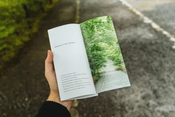
Flyers are an incredibly effective marketing tool. They’re a tangible way to spread the word about your product, service, or event. With the right design, you can grab your audience’s attention and communicate your message in a memorable way.
Besides, these days it’s easy to create a flyer for free with a tool like Vista Create, even if you have no prior experience with graphic design. Let’s look at some tips for creating outstanding flyer designs.
Create your own flyer designs
Know your audience
The first step in designing any flyer is understanding who you’re targeting. Who will receive or see these flyers? Knowing your audience will help you choose the right visuals, fonts, and colors that will appeal to them.
For example, if you’re promoting a children’s event, you may want to incorporate bright colors and fun visuals that kids will be drawn to. But if you’re marketing an upscale product or service, then you may want to opt for more sophisticated visuals and muted colors.
![How to create eye-catching flyer designs in [year] 1 An artist using her iPad and MacBook at the same time for creating art](https://techengage.com/wp-content/uploads/2023/02/word-image-104829-1-702x470.png)
Color psychology in graphic design
The psychology of color is an interesting part of color theory because it looks at how people interpret colors. The way you feel about something, decide on something or understand a message can all be affected by the color of that something.
To succeed as an artist or designer, mastering the use of color is essential. Knowing the meaning of colors and their associations will help you choose the right ones when you’re designing a flyer or any other graphic.
a. Red
Red carries both positive and negative connotations. On the plus side, red is representative of power, passion, and assurance. However, it can also have violent connotations, such as wrath, alarm, or danger. You shouldn’t shy away from red, though; the color has both positive and negative associations, and you may use both to your advantage.
The color red is known to increase the rate at which people make choices. As a result of this physiological response, red is used by nearly every fast food chain as an accent color. Similarly, red is frequently used to signal an impending sale by businesses.
b. Blue
The color blue is associated with peace, relaxation, and friendliness, as in TechEngage’s Brand Kit. It’s a safe, neutral choice that can be used in both formal and informal situations. A lot of well-known companies across several sectors use blue as their primary brand color because it’s associated with reliability.
On the flip side, blue is often associated with melancholy emotions like “feeling blue” or “having the blues.” Blue, in contrast to warmer colors like red and orange, is on the cooler end of the color spectrum. Keep in mind that various shades of blue conjure up various feelings as you select your color scheme.
c. Yellow
Yellow is a happy and energizing color because it makes you think of sunshine and energy. It’s best if used as an accent because it’s a very bright color and really catches the eye. Like red, it can be used to show that something is important or to make a point.
Choose an attention-grabbing visual
When it comes to designing a flyer, the visual is always the most important part of the equation. It should be eye-catching enough that it stands out from other flyers but also convey your message clearly and accurately. Whether it’s a photo of one of your products or an illustration related to what your business does, make sure that it’s high quality and relevant to what you’re trying to promote on the flyer.
![How to create eye-catching flyer designs in [year] 2 Two Apple Macs sitting on a table top with an iPhone and a Japanese cat money saving box](https://techengage.com/wp-content/uploads/2023/02/word-image-104829-2-702x468.png)
Write compelling copy
Once you have chosen an attention-grabbing visual, it’s time to write copy that resonates with your target audience. When writing the copy for your flyer, keep it short, sweet, and direct.
Get straight to business by telling people why they need what you offer and how they can take advantage of it (i.e., call this number or visit this website). Additionally, use action words like “discover,” “explore,” “unlock,” or “enjoy” as they create a sense of urgency in readers, which encourages them to take action quickly!
Conclusion
Creating outstanding flyers doesn’t have to be complicated or time-consuming with these simple tips! By understanding who your target audience is, choosing exciting visuals that stand out from other flyers, and writing compelling copy that speaks directly to them, you can create eye-catching designs quickly and easily! With great design comes great success, so don’t forget these key points when crafting those perfect flyers!
F.A.Qs: Creating flyers with eye-catching design options
Q: What are some important elements to include in a flyer design?
A: Some important elements to include in a flyer design are a clear and concise headline, high-quality images or graphics, a call-to-action, and contact information. It’s also important to consider the color scheme, typography, and layout.
Q: How can I make my flyer design stand out?
A: You can make your flyer design stand out by using bold and contrasting colors, incorporating unique and creative graphics or illustrations, experimenting with typography, and creating a visually compelling layout.
Q: What tools can I use to create a flyer design?
A: There are many tools you can use to create a flyer design, including graphic design software such as Adobe Photoshop or Illustrator, online design platforms like Canva or PicMonkey, or even Microsoft Word or PowerPoint.
Q: What are some tips for creating an effective call-to-action on a flyer?
A: Some tips for creating an effective call-to-action on a flyer include making it clear and specific, using action-oriented language, and emphasizing the benefits or value of taking action. It’s also important to include a sense of urgency, such as a limited-time offer or deadline.
Q: How should I approach choosing images or graphics for my flyer design?
A: When choosing images or graphics for your flyer design, consider the overall message and tone of the flyer, the target audience, and the visual style you want to achieve. It’s also important to choose high-quality, high-resolution images that are relevant to the content of the flyer.
Q: How can I make sure my flyer design is effective in communicating its message?
A: To make sure your flyer design effectively communicates its message, you should start by identifying your target audience and their needs or interests. Use language, imagery, and design elements that will resonate with your audience and clearly convey the message you want to get across. It can also be helpful to get feedback from others and make revisions based on their input.


Share Your Thoughts