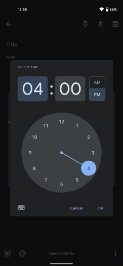
At Google I/O earlier this year, Material You was introduced as the latest iteration of the Material design language. The company has since been updating its apps to follow this new design language as well as updating the elements slowly. Now, Google has announced that its Android apps will feature a new time picker interface of Material You.
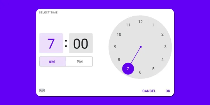
An upcoming update to the time picker’s user interface will make the interface more touch-friendly, according to 9to5Google. Users can see that the hours and minutes fields are more easily tappable due to better spacing with the updated UI. There are also more distinct borders around the AM/PM buttons.
There is sufficient space for entering the time manually when the keyboard is opened in the new UI. In place of the large “Set time” heading, the time fields now comprise the vast majority of the space. There are also new AM/PM buttons to replace the dropdown list. Also, the AM/PM buttons now have a contrasting highlight. Here is a screenshot of the new UI in landscape mode.

Several Google apps have begun rolling out the updated time picker UI. As of Google Keep version 5.21.301.10, it’s available when setting Assistant Reminders in Google Search. However, this feature hasn’t yet rolled out to Calendar, Tasks, and Clock.
Several updates to Google’s apps have been introduced in recent months in order to make use of the Material You design.


Share Your Thoughts