A redesign is supposed to make a platform better. Sometimes it does. Sometimes it triggers the kind of user revolt that sends a company into a years-long spiral it never recovers from. The graveyard of tech platforms that died – or nearly died – after a bad redesign is crowded, and the pattern is almost always the same: product teams fell in love with a vision, ignored what their most loyal users actually needed, and shipped something that broke the unwritten contract between platform and community. When that contract breaks, users don’t complain and stay. They leave. And they take their friends with them.
Digg v4: The Redesign That Killed a Giant
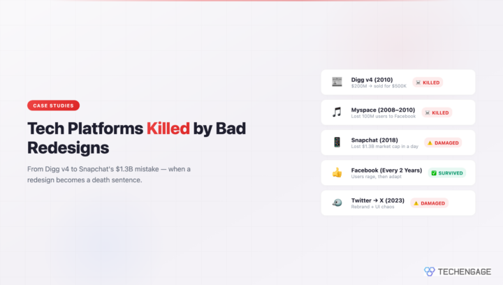
In August 2010, Digg launched version 4 of its platform. At the time, Digg was one of the most influential tech news sites on the internet – a community-driven aggregator where users voted stories up or down, and the front page was a genuine reflection of what the tech-savvy internet cared about. The platform had real power. Getting Dugg could crash a server. The community was loud, opinionated, and fiercely loyal.
Then version 4 launched and everything fell apart within days.
The original Techi article from that period captured exactly what was wrong. Reviewers identified three critical fixes Digg needed urgently: squash the bugs that made the new interface nearly unusable, bring back the Bury button that let users collectively push down low-quality content, and stop overriding user habits by forcing new behaviors on a community that had spent years building workflows around the old system. At the same time, the review acknowledged three things Digg actually got right with v4: the cleaner visual design was a genuine improvement, the social integration with Facebook and Twitter made sense for 2010, and the new “My News” personalized feed was a smart concept.
The problem was that none of the required fixes came. The bugs stayed. The Bury button stayed gone. Users who had spent years curating quality content found their primary moderation tool stripped away overnight, replaced by a system that gave publishers – including major media companies – the ability to push content directly to the front page. The community that built Digg’s value felt like they had been evicted from their own house and replaced with a corporate syndication feed.
The exodus to Reddit was immediate and organized. Users coordinated on Reddit to make the switch permanent. Traffic collapsed. Within months, the Digg front page became a ghost town. The company tried patches and partial rollbacks but the trust was gone. In 2012, Betaworks acquired Digg for roughly $500,000 – a figure that should be read next to Digg’s peak valuation of around $200 million, which included a reported acquisition offer from Google for $80 million that Digg turned down in 2008. Whatever remained after v4 was worth less than a Series A round for an unknown startup.
The core failure was not the design itself. It was the decision to remove the Bury button – the feature that gave the community its identity and its power. When you take away the thing that makes a community feel like a community, you no longer have a community. You have an audience. And audiences, unlike communities, have no loyalty.
Myspace’s Death by a Thousand Redesigns (2008-2010)
Myspace’s decline is often framed as a Facebook story – the scrappy Harvard upstart ate the incumbent. But the mechanics of Myspace’s fall are more instructive than that simple narrative suggests. Myspace did not lose because Facebook existed. Myspace lost because it spent three years redesigning itself in Facebook’s image while Facebook was busy becoming a better version of Facebook.
Between 2008 and 2010, Myspace went through multiple major redesigns. Each one was driven by the same panic: Facebook’s clean, consistent interface was drawing users away from Myspace’s chaotic, customizable pages. So Myspace tried to clean up. It stripped away customization options that users loved. It reorganized navigation that people had memorized. It added features that looked like Facebook clones without the underlying social graph sophistication that made Facebook’s version of those features actually work.
The result was a platform that satisfied nobody. Existing users felt the personality had been bleached out of the product. New users looked at the still-messy, half-reformed interface and chose Facebook anyway. Each redesign iteration cost Myspace another slice of its loyal base without gaining a meaningful number of converts.
At its peak, Myspace had over 100 million registered users and was the most visited website in the United States for a stretch of time in 2006. News Corp bought it for $580 million in 2005, confident they had purchased the future of social networking. By 2011, they sold it to a group of investors led by Justin Timberlake for $35 million. The buyers attempted a pivot to music – which showed some promise briefly – but the platform never recovered its cultural relevance.
The lesson from Myspace is specific: reactive redesigns driven by competitive fear tend to satisfy no one. You cannot out-Facebook Facebook by becoming a worse Facebook. You can only survive by being a better version of yourself.
Tumblr’s Post-Yahoo Transformation
Tumblr’s story is a case study in what happens when a platform’s core identity conflicts with its new owner’s business requirements. Yahoo acquired Tumblr in 2013 for $1.1 billion, a price that reflected genuine belief in the platform’s creative community and its hold on a younger demographic. At the time of acquisition, Tumblr had around 300 million monthly visitors and was genuinely influential in internet culture, fandoms, and the kind of creative expression that does not fit neatly into Facebook’s structured social graph.
The years after acquisition brought a slow series of changes that each, in isolation, seemed minor. The dashboard was tweaked. Advertising formats were introduced that felt out of place with the platform’s aesthetic. Features that long-time users relied on behaved differently. None of this was catastrophic on its own, but it accumulated.
The actual breaking point came in December 2018 when Tumblr – by then owned by Verizon after its acquisition of Yahoo – banned adult content. The NSFW content ban was framed as a policy necessity, partly tied to issues with the App Store and child safety concerns. But the execution was clumsy and the filtering algorithms flagged enormous amounts of entirely benign content. Artists found their work hidden. LGBTQ+ users, many of whom had used Tumblr specifically because it was a relatively safe creative space, lost posts and communities overnight.
The traffic drop after the ban was dramatic and immediate. The community that had made Tumblr worth $1.1 billion simply left. Verizon sold the platform to Automattic – the company behind WordPress.com – in 2019 for a reported $3 million. The gap between the purchase price and the sale price – $1.1 billion down to $3 million – is one of the most spectacular value destructions in social platform history. Automattic has made genuine efforts to stabilize and grow Tumblr since the acquisition, but rebuilding a creative community that dispersed to dozens of other platforms is slow, hard work.
Snapchat’s 2018 Redesign Disaster
In early 2018, Snap Inc. rolled out a major redesign of Snapchat with a clear strategic goal: separate content from friends, creating a more traditional media-consumption experience alongside the personal messaging the app was built on. The logic made sense from a business perspective. Advertisers wanted a cleaner content environment. The old Snapchat was famously confusing to new users. Making Stories from publishers and brands separate from friends’ Stories seemed like a way to professionalize the platform without abandoning its core.
The execution was a different story. Existing users found their familiar navigation scrambled. The separation that felt logical in a product meeting felt deeply wrong to people who used Snapchat primarily to share moments with close friends. The platform had been designed around intimacy, and the redesign pushed it toward a broadcast model without enough acknowledgment of what that shift meant for daily users.
The most memorable moment of the backlash came from Kylie Jenner, who tweeted in February 2018 that she had stopped using Snapchat. The tweet was brief – essentially saying she did not open the app anymore and asking if others felt the same. Snap’s stock dropped roughly 6% the following day, wiping out approximately $1.3 billion in market capitalization. One celebrity tweet should not be capable of doing that kind of damage to a public company. The fact that it did reflected how fragile Snap’s position already was in the wake of the redesign rollout.
Snap partially reversed course, restoring some elements of the old interface and adjusting the content separation based on user feedback. The stock eventually recovered and Snap has remained a functional, if much humbler, business since then. But the 2018 redesign episode permanently damaged the narrative around Snapchat’s growth potential and contributed to a period of user decline that the company spent years trying to claw back.
Twitter to X: The Ongoing Rebrand
Elon Musk’s acquisition of Twitter in late 2022 and the subsequent rebrand to X in July 2023 is the most recent major example of redesign-as-identity-crisis. The rebrand was not just visual – it was philosophical. The Twitter brand, built over 17 years, carried genuine recognition and cultural weight. The blue bird was one of the most recognized logos in tech. Replacing it overnight with a stylized X, removing the word “Twitter” from the platform’s name, and reorienting the product’s stated mission toward becoming an “everything app” amounted to asking users to forget what they knew about the platform and accept a new one in its place.
The UI changes that followed caused their own friction. The “For You” algorithmic feed became the default over the chronological “Following” feed, confusing users who had relied on seeing content from accounts they explicitly chose to follow. The verification system was dismantled and rebuilt around paid subscriptions, stripping the blue checkmark of its original meaning and creating confusion about who was actually verified versus who simply paid for a badge. Multiple feature changes rolled out with minimal notice and inconsistent communication.
Advertisers paused spending on a significant scale. Major brands cited brand safety concerns alongside general uncertainty about the platform’s direction. The revenue impact was real – Twitter/X reportedly saw substantial advertising revenue declines through 2023, though exact figures vary by source and the company is no longer publicly traded so detailed financials are not available.
The platform remains functional and, depending on the metric, still has a large user base. But the identity crisis is genuine. Many longtime users now use X but still call it Twitter. The brand transition has not fully landed. Whether X eventually carves out a coherent new identity or continues in an awkward in-between state is still unresolved as of mid-2026.
Redesigns That Actually Worked
Before concluding that redesigns are inherently dangerous, the counterexamples matter. Several major platforms have gone through significant visual and functional changes that users initially hated – loudly – and then adapted to without mass exodus.
Facebook has redesigned its interface more times than most users can count. Each iteration has triggered a wave of complaints, petitions, and declarations that “Facebook is ruined.” None of them have mattered in any sustained way. Why? Because Facebook consistently preserved the core actions users came to the platform to perform. You could still post, see your friends’ posts, message people, and manage events. The furniture moved but the house was the same. Users complained for a few weeks and then forgot the old layout existed.
Instagram’s 2016 rebrand – replacing the retro camera icon with a flat, colorful gradient icon – generated genuine fury. Design critics called it generic. Users said the new logo was ugly and confusing. Within a week, the conversation had moved on entirely. The flat icon is now so established that few people can accurately describe what the old one looked like. The rebrand succeeded because it was purely cosmetic. The app worked the same way. Nothing about how you used Instagram changed.
Gmail’s Material Design overhaul in 2018 is another example. The new interface was cleaner and more visually organized, but all the same actions were available in largely the same places. Power users found the transition slightly annoying. Regular users barely noticed. The redesign improved the product without breaking the habits that made it valuable.
The pattern in successful redesigns is consistent: the visual layer updates, the functional core stays intact, and users are given enough time and familiarity cues to adjust.
The Psychology of Change Aversion vs. Genuine UX Failure
There is a temptation for product teams to dismiss all redesign backlash as change aversion – the well-documented human tendency to resist any unfamiliar interface regardless of whether it is actually worse. That instinct is not wrong, exactly. Users do complain about changes that are net improvements. The trick is knowing when complaints signal real problems versus normal adjustment friction.
Research on interface adaptation generally shows that change aversion peaks in the first one to two weeks after a redesign and fades significantly within four to six weeks, provided the underlying functionality is intact. Users who say “I hate this new layout” in week one and “I can’t remember what the old one looked like” in week six are experiencing normal change aversion. The complaints are real but they are temporary.
Genuine UX failure shows a different pattern. Engagement metrics do not recover after the initial dip. Session lengths stay down. Core actions – posting, sharing, buying, searching – show sustained declines even after users have had weeks to adjust. Support tickets about specific broken workflows stay elevated. And crucially, the complaints are specific rather than general. “I hate how different this looks” is change aversion. “I can no longer do the thing I came here to do” is a product failure.
Digg’s Bury button removal falls clearly into the second category. Users were not complaining about the new visual design – many of them acknowledged it looked better. They were complaining that a specific, critical moderation function had been taken away. That complaint never would have faded because it described a real loss of capability, not an unfamiliar visual arrangement.
Product teams that understand this distinction can separate signal from noise. When metrics recover in weeks, you had a successful redesign with normal friction. When they do not recover, you have a structural problem that no amount of “users will adjust” optimism will fix.
Reddit’s old.reddit.com Phenomenon
Reddit’s handling of its 2018 interface redesign stands out as one of the smarter decisions any major platform has made in recent years. When Reddit launched its new design – a cleaner, card-based interface clearly aimed at attracting mainstream users – the reaction from its power user base was predictably negative. Reddit’s core users are disproportionately technical and disproportionately averse to change, and the new design was a significant departure from the dense, text-forward layout many had used for a decade.
Reddit’s response was to keep the old design accessible. The old interface remained available at old.reddit.com, and the company has maintained it as a functioning option even as the new design became the default for new users. This created an unusual situation where two distinct interfaces have coexisted for years, serving two distinct audiences. Power users, moderators, and longtime community members continued using the old design. New users, arriving from mobile apps or via search, encountered the new design and found it approachable.
The result has been genuinely good for Reddit. The new design helped the platform grow toward mainstream audiences and supported better monetization. The old design kept the moderation community – the people who actually run Reddit’s subreddits and enforce its community standards – from revolting and taking their communities elsewhere. The platform got the benefits of both without forcing a single group to sacrifice what they valued.
It is worth noting that as Reddit moves further into its post-IPO life, there have been hints that old.reddit.com’s long-term future may eventually come into question. But for now, the dual-interface approach remains one of the most pragmatic redesign strategies in social media history.
Modern Lessons: Discord, Spotify, and YouTube
The platforms that have managed consistent growth without triggering Digg-style collapses tend to share a specific approach to interface evolution: they change constantly, but they change incrementally, and they almost never remove a core function without providing an equivalent or better replacement.
Discord updates its interface regularly – sometimes multiple visible changes in a single month – but each change is small enough that users barely register it. The core loops of the product (join a server, talk to people, share things) have remained functionally identical even as the visual treatment and secondary features have evolved significantly. Discord also does extensive internal testing before shipping changes broadly, and it has a documented practice of rolling features out to small percentages of users before full deployment.
Spotify has introduced major interface changes over the years, including a significant redesign in 2023 that reorganized the home screen and changed how podcasts and music were integrated. The initial reaction was mixed, particularly from users who preferred the older, music-focused layout. But Spotify used A/B testing extensively before rolling out the changes, and it built feedback mechanisms into the update process. The company treated the rollout as a hypothesis to be validated rather than a decision to be defended, which left room for adjustments based on actual usage data.
YouTube has changed dramatically since its early days, and almost every major interface shift has generated complaints. The move from a five-star rating system to a thumbs up/down system, the introduction of the Shorts feed, the constant adjustments to the recommendation algorithm – all of these have attracted criticism. YouTube survives these cycles because the fundamental value proposition is unchanged: you can find and watch video content. Everything else is negotiable.
The modern approach to redesign can be roughly summarized as: use feature flags to test with subsets of users, measure actual behavior rather than relying on survey feedback, make incremental changes rather than big-bang launches, and never remove a high-usage feature without a direct replacement that serves the same need. None of this is complicated in concept. The hard part is resisting the organizational pressure to ship a complete vision all at once.
When to Force Users Forward
Not all forced migrations are mistakes. Sometimes the old design genuinely must die, and the kindest thing a platform can do is be honest about it and make the transition as smooth as possible.
The end of Internet Explorer is the clearest example. Microsoft maintained IE for years past its useful life specifically to avoid user disruption, and the result was that a significant portion of the web had to maintain IE-compatibility hacks for a browser that was actively making the internet worse. Eventually Microsoft killed IE, gave users ample notice, and pushed people toward Edge. The transition was not frictionless, but it was necessary. The old design had become a technical liability.
Flash is the other canonical example. Adobe and major platforms – led by Apple’s decision to exclude Flash from iOS – forced the industry toward HTML5 video over roughly a decade. The transition was slower and messier than it needed to be, but the end state was correct. Flash was a security risk and a performance problem, and no amount of user affection for Flash-based games changed those underlying facts.
The difference between these forced transitions and the Digg or Myspace situations is not the forcing itself – it is the quality of the replacement. IE and Flash were replaced with things that were genuinely better for users even if the transition was uncomfortable. Digg’s Bury button was replaced with nothing that served the same function. Myspace’s personality was replaced with a pale Facebook imitation. When you force users forward, they need somewhere worth going.
The formula is straightforward even if execution is hard: give users meaningful notice, provide a clear migration path, make sure the new thing is actually better at the core use case, and do not confuse “users are complaining” with “users are leaving.” The first is normal. The second is the signal that the redesign has crossed from uncomfortable into genuinely broken.
Digg never got that second part right. The new design was not better at the core use case of community curation – it actively undermined it. Everything else the platform got right about v4 was irrelevant once that fundamental failure was in place. Cleaner aesthetics and social integration cannot save a community platform that no longer trusts its community.


People who are interested in the new Digg may also be interested in quippd — a collaboratively edited social news site that works a lot like Digg4 (we were out before they were!) but adds some more wrinkles to the experience.
Check it out at: