Typography shapes the way audiences perceive a brand, a publication, or a digital product. Every font carries its own personality — from the authority of a classic serif to the playfulness of a decorative display face. Understanding font classifications makes it easier to pair typefaces, maintain visual consistency, and communicate the right tone across print and digital media.
The following guide breaks down the six main font categories, explains what makes each one distinct, and highlights when to use them in real-world design projects.
Table of Contents
Serif Fonts

Serif fonts are among the oldest typeface families in Western typography, dating back to the late 15th century. The defining feature is the small decorative stroke — called a “serif” — that extends from the ends of each letter. These strokes guide the reader’s eye horizontally along a line of text, which is one reason serif fonts remain the standard choice for printed books, newspapers, and academic papers.
Serif fonts break down into several subcategories. Old-style serifs like Garamond and Caslon have a calligraphic quality with low contrast between thick and thin strokes. Transitional serifs such as Times New Roman and Baskerville offer sharper contrast and a more refined appearance. Modern serifs like Didot and Bodoni take this contrast to an extreme, with hairline-thin horizontals and bold verticals.
Brands that want to project tradition, authority, and sophistication tend to gravitate toward serif fonts. The New York Times, TIME magazine, and Tiffany & Co. all rely on serif typefaces in their logos and editorial layouts.
Best used for: Body text in print materials, book publishing, editorial design, luxury branding, academic documents, and law firm websites.
Popular examples: Times New Roman, Georgia, Garamond, Baskerville, Palatino, Merriweather.
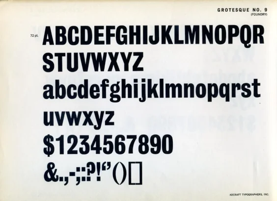
Sans Serif Fonts

Sans serif fonts drop the decorative strokes entirely — “sans” is French for “without.” The result is a clean, modern typeface with uniform stroke widths and open letterforms. German and Swiss designers popularized the category in the early 20th century, and the Helvetica typeface (designed in 1957) became one of the most widely used fonts in history.
On screens, sans serif fonts tend to render more clearly at small sizes because they lack the fine detail of serifs that can blur on low-resolution displays. This is why Google chose Roboto for Android, Apple developed San Francisco for iOS, and most modern websites default to sans serif body text.
Sans serif typefaces pair naturally with serifs in design layouts — a common approach uses a sans serif heading with serif body text, or vice versa. Brands like Calvin Klein, The Guardian, LinkedIn, and Spotify all use sans serif fonts to communicate simplicity, honesty, and a forward-thinking aesthetic.
Best used for: Web and mobile interfaces, tech branding, presentations, signage, headlines, and any context where screen readability matters.
Popular examples: Helvetica, Arial, Futura, Roboto, Open Sans, Montserrat, Inter.
Slab Serif Fonts

Slab serif fonts (also called Egyptian fonts) emerged in the early 19th century when advertisers needed bold, attention-grabbing typefaces for posters and headlines. The serifs in this category are thick, block-like, and carry the same weight as the main strokes of each letter — a stark contrast to the delicate serifs of traditional typefaces.
Slab serifs can be either geometric (with rigid, angular shapes like Rockwell) or humanist (with slightly rounded, friendlier shapes like Clarendon). The typewriter-inspired subcategory, including fonts like Courier, also falls under the slab serif umbrella, though these are more commonly classified as monospaced.
The heavy, confident lines of slab serifs project dependability and strength. Volvo, Honda, and Sony have all used slab serif logotypes at various points to reinforce a sense of engineering precision and reliability. Slab serifs also work well in editorial headers and infographics where text needs to stand out against busy backgrounds.
Best used for: Headlines, poster design, logos for automotive or industrial brands, editorial headers, and any context requiring strong visual weight.
Popular examples: Rockwell, Clarendon, Roboto Slab, Arvo, Zilla Slab, Museo Slab.
Script Fonts

Script fonts emulate handwriting and calligraphy, with flowing strokes that connect letters together. They split into two broad subcategories: formal scripts (like Edwardian Script and Snell Roundhand) that mirror traditional calligraphy with ornate flourishes, and casual scripts (like Pacifico and Brush Script) that have a more relaxed, hand-drawn feel.
Legibility is the biggest tradeoff with script fonts. The curling, connecting strokes look beautiful in short bursts — a logo, a wedding invitation, or a product label — but become difficult to read in longer passages. Designers typically limit script fonts to headlines, pull quotes, or accent text and pair them with a clean sans serif or serif for body copy.
Script fonts communicate femininity, elegance, creativity, and a personal touch. Coca-Cola‘s iconic Spencerian script logo has remained virtually unchanged since 1887, and Instagram‘s earlier logotype used a casual script to convey warmth and authenticity before switching to a sans serif wordmark.
Best used for: Logos, wedding stationery, greeting cards, cosmetic packaging, restaurant menus, and short accent text in editorial layouts.
Popular examples: Brush Script, Pacifico, Lobster, Great Vibes, Dancing Script, Allura.
Decorative Fonts

Decorative fonts — also known as display or novelty fonts — break the rules of conventional typography in favor of artistic expression. They can incorporate 3D effects, shadows, textures, hand-drawn elements, retro styling, or themed aesthetics. Unlike the other categories, decorative fonts are not designed for readability at small sizes or in long text blocks.
The strength of decorative fonts lies in their ability to establish a mood instantly. A horror movie poster might use a dripping, distressed typeface, while a children’s toy brand might use rounded, bubbly letters. Lego’s custom block-lettered logo and Fanta’s playful, rounded wordmark are both examples of decorative fonts doing their job — capturing attention and reinforcing brand personality in a single glance.
Decorative fonts are also popular in tattoo art, graffiti, album covers, and event posters where visual impact outweighs the need for body-text legibility. The key rule with decorative fonts: use them sparingly and only at large sizes for headlines, logos, or short phrases.
Best used for: Logos, poster headlines, packaging, event invitations, game titles, album artwork, and any context where the font itself is a visual element.
Popular examples: Impact, Bebas Neue, Lobster, Jokerman, Papyrus, Cooper Black.
Monospaced Fonts
Monospaced fonts give every character — whether it is a narrow “i” or a wide “m” — the exact same horizontal space. This design originated from mechanical typewriters, where each key had to advance the carriage by a fixed distance. While proportional fonts have largely replaced monospaced typefaces in general text, monospaced fonts remain the standard in specific contexts.
Software developers use monospaced fonts almost exclusively in code editors because the fixed character width makes it easy to align code vertically, spot indentation errors, and distinguish between similar characters (like the letter “l” and the number “1”). Terminal interfaces, command-line tools, and IDE environments all default to monospaced typefaces.
Beyond coding, monospaced fonts appear in screenplays (where Courier is the industry standard), tabular data displays, and design projects that aim for a retro, typewriter-inspired aesthetic. Brands and publications occasionally use monospaced fonts to convey a raw, technical, or underground vibe.
Best used for: Code editors, terminal interfaces, screenplays, tabular data, retro-themed design, and technical documentation.
Popular examples: Courier, Consolas, Fira Code, JetBrains Mono, Source Code Pro, IBM Plex Mono.
How to Choose the Right Font
Selecting a font goes beyond personal preference — the typeface needs to match the project’s purpose, audience, and medium. A few guiding principles simplify the decision:
- Define the tone first. A law firm’s website demands the gravitas of a serif like Garamond, while a fitness app benefits from the energy of a geometric sans serif like Montserrat.
- Prioritize readability. Body text should almost always be a serif or sans serif at 16px or larger on screens. Save script and decorative fonts for headlines and accents.
- Limit the number of typefaces. Most professional designs use two fonts — one for headings and one for body text. Three is the practical maximum before a layout starts to look disjointed.
- Test across devices. A font that renders beautifully on a Retina display may look blurry on a standard monitor. Google Fonts and Adobe Fonts both offer web-optimized typefaces that render consistently across browsers.
- Check licensing. Free fonts from Google Fonts are open-source and safe for commercial use. Premium fonts from foundries like Hoefler & Co. or Monotype require purchasing a license.
Frequently Asked Questions
What are the 4 major font types?
The four major font types are serif, sans serif, script, and decorative (display). Serif fonts have small strokes at the ends of letters (e.g., Times New Roman), sans serif fonts lack those strokes (e.g., Helvetica), script fonts emulate handwriting (e.g., Pacifico), and decorative fonts prioritize visual impact over readability (e.g., Impact).
What is the difference between a font and a typeface?
A typeface is the overall design of a set of characters — for example, Helvetica is a typeface. A font is a specific weight, style, and size within that typeface — for example, Helvetica Bold 14pt is a font. In everyday language the two terms are often used interchangeably.
What are the 5 main types of fonts with examples?
The five main types are: Serif (Times New Roman, Georgia, Garamond), Sans Serif (Arial, Helvetica, Roboto), Script (Brush Script, Pacifico, Lobster), Decorative/Display (Impact, Bebas Neue, Cooper Black), and Monospaced (Courier, Consolas, Fira Code).
Which font type is best for websites?
Sans serif fonts are the most common choice for website body text because their clean letterforms render clearly on screens at all resolutions. Popular web-safe sans serif fonts include Roboto, Open Sans, Inter, and Lato. Serif fonts like Merriweather and Georgia also work well for editorial-style websites that want a more traditional look.
How many fonts should a design use?
Most professional designs use two fonts — one for headings and one for body text. Using more than three fonts in a single project can make the layout look cluttered and inconsistent. A common pairing strategy is to combine a serif heading font with a sans serif body font, or vice versa.


Share Your Thoughts