The Android 12 public beta is now available to download after the three developer previews. On the first day of the I/O developers’ conference, Google brought out the details of its latest version of the mobile operating system.
In a nutshell, Android 12 comes with a major visual overhaul of the mobile operating system. Google has come with a “Material You” design, which aims to redesign almost every element of Android’s user interface. As it was much obvious from the remarks of Sameer Samat, VP of product management, Android and Google Play, the Android 12 is,
“the biggest design change in Android’s history,”
Redesigned Widgets
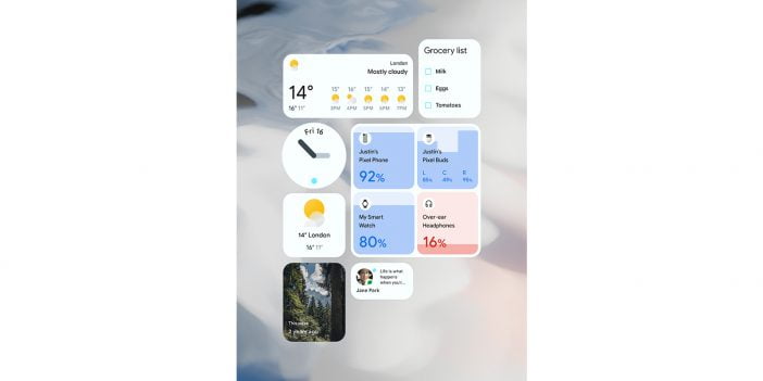
Several new interactive controls have been added, including checkboxes, toggles, and radio buttons, and widget personalization has been made easier. In addition to its great UI, Android 12 widgets are automatically rounded and padded, bringing an eye-catching visual appeal to every launcher and home screen. Responsive layouts make widgets adaptable to phones, tablets, and foldable screens. The widgets can also use dynamic color APIs, creating a personalized, consistent look.
Smooth Audio Transition
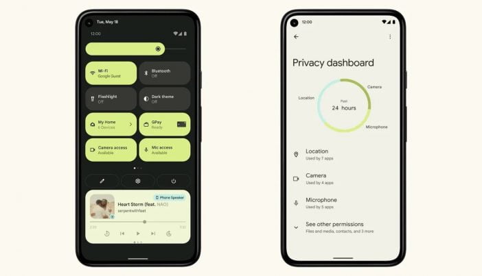
As visuals aren’t the only aspect of UI. Hence, Google has also made improvements to the way the audio focus is handled. Audio fades out automatically when an app loses focus, preventing apps from playing over each other and facilitating seamless transitions between them. This is particularly relevant in foldable and multi-screen Android environments.
More Animation & Performance
In order to prevent excessive resources and jitter, Android has optimized the way the system displays core elements. As a result, Windows and the package manager are using 22 percent less CPU, and the system server is using 15 percent less of the big core, which consumes more power and runs at a greater battery drain. Interrupts have also been reduced. Last but not least, the “overscroll” animation has been improved – the effect of scrolling to the end of a page. You will notice that the screen will stretch a bit when you are unable to scroll anymore.
New Privacy Features
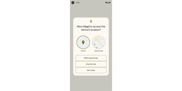
Android 12 introduces several changes to privacy, mostly targeting three sensors Google believes are crucial trigger points for people: location, camera, and microphone.
The camera and mic, whenever they are working, the green dot on the upper right screen will light up to inform the user. The two optional toggles are also now available in Quick Settings, where users can turn this feature off as well. When any third-party app looks to access the mic and camera, a pop-up box will rise and ask for permission from the user.
As far as the location aspect is concerned, Google tweaked it a new way. Now, users have the right to enable location in two modes, i.e., approximate or precise. The approximate location will never tell the app your exact location.
Google decided to remain silent about its app tracking policy. In fact, the company expressed that it does not believe that advertising and data privacy are at loggerheads with each other.
“From our standpoint on Android, we don’t have anything to announce at the moment, but we are taking a position that privacy and advertising don’t need to be directly opposed to each other. That, we don’t believe, is healthy for the overall ecosystem as a company. So we’re thinking about that working with our developer partners and we’ll be sharing more later this year.”


Share Your Thoughts